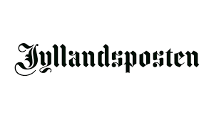
Jyllandsposten returns to 1877 gothic logo, Digi Mart USA News (Denmark): Danish newspaper Jyllandsposten is returning to its logo from 1877, which uses gothic lettering. At the same time, the publication is launching an entirely new design across its digital platforms and print edition, and it is dropping the hyphen from its name.
According to editor-in-chief Christina Agger, the paper chose to draw inspiration from its long history. Jyllandsposten has existed for 155 years, which she says signals a certain stability and credibility.
She writes in a editorial that the historic logo brings those qualities into sharper focus.
Agger acknowledged that the new logo may cause some readers to frown. She described it as neither the obvious nor the easy choice, but said that may be why it suits the newspaper well.
In her view, it captures the story of a paper that has always had the courage to go its own way.
Art director Katinka Bukh addressed concerns that the gothic letters could evoke Germany during the Nazi era. She stressed that Jyllandsposten and the typeface are much older than Nazism.
Bukh told the trade publication Journalisten that the design strategy traces back to 1871, when six men gathered in Jutland soil and decided to start a protest newspaper, drawing on something defiant.
Bukh also pointed out that other publications and organizations use the same letterforms, including The New York Times, Frankfurter Allgemeine and the music festival Copenhell.